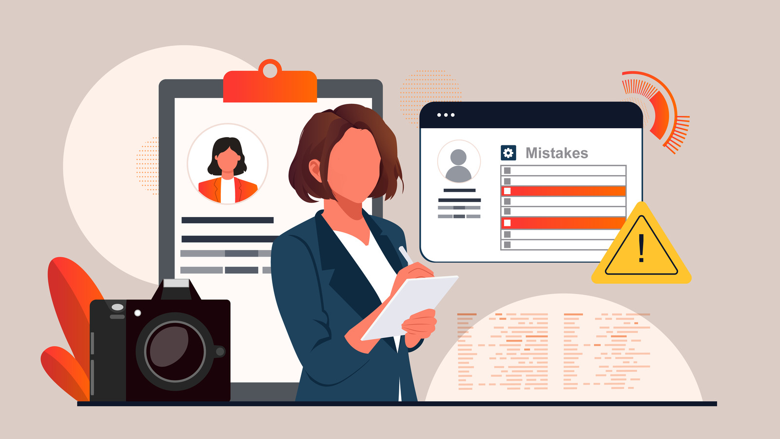
Your webcam streaming profile represents a critical tool in your online presence. It’s an introduction to potential viewers, builds trust among your fans, and prompts users to leave tips that fuel your success. Even tiny errors in how your profile is designed or written can deter people, losing you potential earnings before your performance even begins.
If your viewership isn’t hitting your targets, or if your chat room seems unusually quiet, it may be time to take a closer look at your profile. You might be unwittingly making common profile mistakes that are costing you viewers and, ultimately, revenue. Here’s a quick run-through of these potential pitfalls, and some effective ways to address them.
Profiles overloaded with flashy text, a plethora of images, and a surplus of emojis can confuse prospective viewers. When every element is clamoring for attention, it’s challenging for anything to truly stand out.
The solution? Opt for a clean, accessible layout with clearly labeled sections. Use headings like “About Me,” “Tip Menu,” and “Rules” to organize your information. Allow some breathing space between different sections for easy reading, and remember, a user-friendly profile instills confidence in your viewers.
When it comes to first impressions, your banner plays a leading role. A banner that appears stretched, blurry, or generic can make your entire operation appear amateur, causing viewers to assume your content aligns with the same low standard.
To rectify this, create a sleek, high-resolution banner that articulates your brand. Incorporate your name, a striking visual component, and a message or theme that clues viewers into what they can expect from your streams. If graphic design isn’t your forte, there are plenty of free tools like Canva available, or you could consider outsourcing to a freelancer for a customized banner.
Viewers need to know what they’re getting for their tips. If it’s unclear what they’re tipping for, they’re liable to do nothing at all. Even your most dedicated fans appreciate clear direction. A missing or complicated tip menu could result in missed income.
To avoid this, prominently display a well-organized tip menu on your profile. Use bullet points or tidy line breaks to list out your offerings, highlight popular options, and include a range of both small, playful tips and bigger, more rewarding options. Be precise and keep it updated.
Generic bios do little to distinguish you from the crowd. Phrases like “I love to have fun,” or “Let’s have a great time,” are far too vague to pique any viewer’s interest.
Instead, craft a succinct, personalized introduction that reflects your persona and the unique style of your shows. Specify your niche or provide a preview of what viewers can anticipate. A clear, concise bio will do wonders for your profile’s appeal.
If your offsite links are hard to locate or dysfunctional, viewers can’t follow your activities outside of the platform or support you through other means. Many won’t bother to seek clarification; they’ll simply leave.
Address this by clearly displaying links to your fan page, social media accounts, tip jar, or wishlist. Use buttons or emojis to ensure they’re easy to find, and always remember to verify that your links are functioning correctly.
Inconsistent design choices, such as random fonts, clashing colors, and mismatched images, can make your profile appear chaotic. Even if your content is top-notch, an unbranded profile can make you easily forgettable.
To resolve this, choose a color theme and stick with it. Use uniform fonts, language, and design elements. Aim for a streamlined profile that mirrors your personality. The more coordinated it appears, the more professional it seems.
Many viewers access your profile from a mobile device. If your profile only looks good on a desktop, you’re alienating a significant portion of your audience.
Combat this by testing your profile on a mobile device. Opt for vertical formatting and avoid wide layouts. Steer clear of lengthy horizontal banners, double columns, or large graphics that may get cut off on smaller screens, ensuring your profile is readable on all devices.
Your profile serves as your first impression, your sales pitch, and your conversion tool. By avoiding these common mistakes, you increase your chances of retaining viewer attention, receiving tips, and converting new viewers into loyal fans. For more information on these common errors, check out this article on 7 common profile mistakes that cost you viewers.
Even minor adjustments, such as increasing the space between sections, refining your tip menu, or enhancing your banner can make a world of difference. Maintain a clear, clean, and consistent profile, and you’ll find it working in your favor, day in, day out.
Leave a Reply